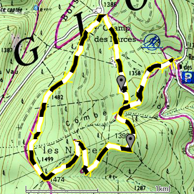
In MyTrails 1.3.24 (currently in beta), I am very excited to add two new colorizations (or 4, depending how you look at them)!
How this came about was: one user wanted an easier way to figure out which way a track that circled back on itself came into and left the intersection. Playing with different possibilities, I realized that being able to visualize time and distance on the track (other than by looking at the speed visualization and performing differential math in our heads), would be useful.
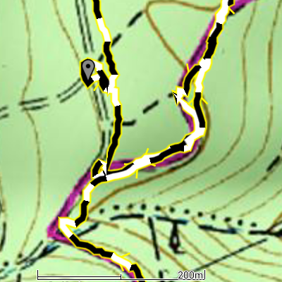
I think my favorite is the distance colorization: it uses alternating black and white bands every 100m (100yd if you’re using imperial units), so you can very easily count the distance between two points on the track. It’s also easier than looking at the scale imagine twisting it along the track.
This only works if the track contains a high-enough density of points that MyTrails can alternate colors (which can happen only on a track point, not between points). Generated tracks (from a driving direction service, or by manually adding track points), or highly-simplified tracks (such as you may get from an online track sharing service) may not contain enough track points. Similarly, zooming out causes MyTrails to simplify the track and lose the ability to correctly represent the track.
Similarly, if you want to count how long it took to go from one point to another, the time colorization is very helpful. Each band corresponds to one-minute intervals.
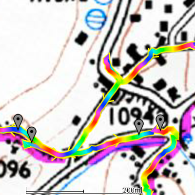
The “rainbow” versions of these colorizations look silly, but they’re useful to try and follow the track through an intersection. Just keep in mind the sequence of colors, and follow along.
Unfortunately, when you look at these in MyTrails 1.3.24, they will not look as nice and smooth as these screenshots. This is because these were taken with an alpha version of 1.4.0, which I will tease more in another post soon!


