Monthly Archives: October 2013

Nicer track rendering

One of MyTrails’ design principles has always been performance. I’m very proud of the fact that no other Android mapping application is as fast and smooth as MyTrails. This is partly because it uses OpenGL to render the map and tracks.

A big part of that is that MyTrails has to be able to display tens of tracks with thousands of track points without slowing down, and because of this, I have been hesitant to change the track rendering algorithm.

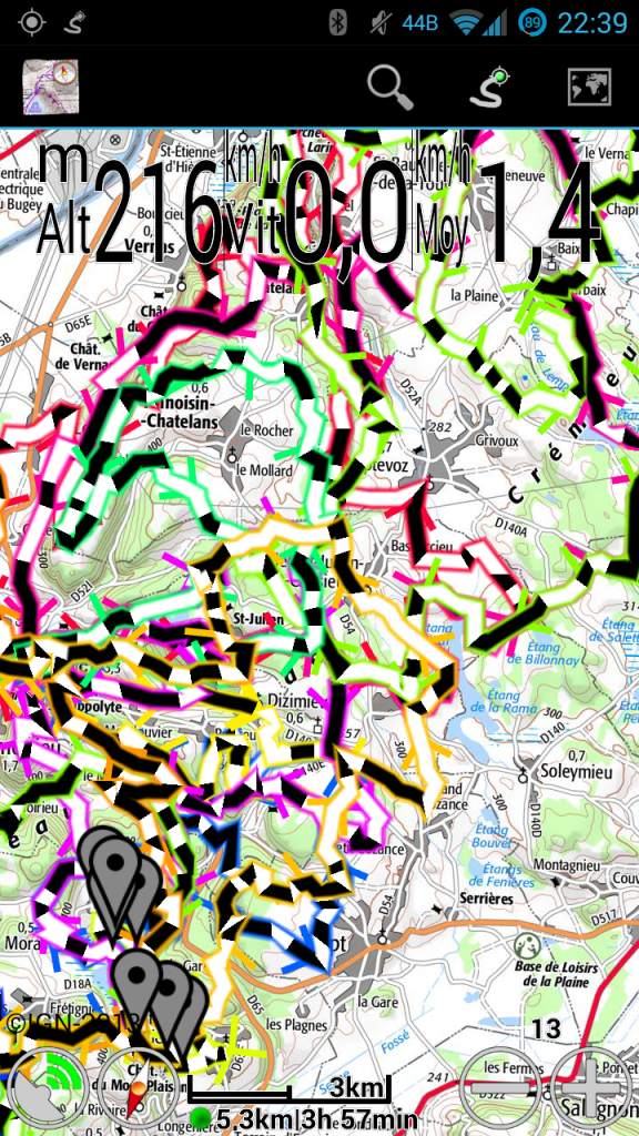
Things came to a head recently when I implemented the new Time and Distance colorizations. Suddenly (and especially in an emulator running on my low-pixel density computer display), the track looked very crude to me. And it’s always been: zoom out enough and it degenerates into a mess of horizontal and vertical hatches. Even up close, sharp edges in the track look broken. This is because OpenGL’s support for lines is very, very crude.

Also, it’s limited in terms of the thickness of lines it can draw (based on the GPU in each model of phone), and high-density screen in devices that use low-end GPUs (such as the Nexus 4) caused the tracks to be thinner than they should, and lack a border.

No more! In MyTrails 1.4.0, I’ve rewritten the track rendering algorithm, and lines are smoothly blended, can be rendered at any width, and are unbroken at any zoom level. And they’re still very fast (56 frames per second on a Galaxy S3, compared to 57fps for the previous algorithm).

New track rendering

New track rendering

During the beta period for 1.4.0, I will try to keep the hidden option ‘toggle track mode’ operational so you can compare the modes for yourself (there’s an intermediate mode that uses un-smoothed lines). If some phones are too slow for the new rendering mode, I can make it an official option for the release.

You can test the new rendering in MyTrails 2.0.0a6 and shortly in 1.4.0b1.

A few more screenshots to compare the old and new modes.

1.3.24-1.3.26

  • New map: VTTrack-ST (single-track layer map)
  • New colorizations: distance and time
  • Layer maps can be taken off-line
  • Show disabled GPS icon when no data is received from the GPS
  • Screen lock no longer engages while using a dialog (only on Android 4.2 and later)
  • File upload progress is more regular
  • 2.1 work-around for IGN is no longer necessary
  • GPSies: download your own private tracks

1.3.25 and 1.3.26 are bug-fix releases, sorry!

New colorizations: distance and time

In MyTrails 1.3.24 (currently in beta), I am very excited to add two new colorizations (or 4, depending how you look at them)!

How this came about was: one user wanted an easier way to figure out which way a track that circled back on itself came into and left the intersection. Playing with different possibilities, I realized that being able to visualize time and distance on the track (other than by looking at the speed visualization and performing differential math in our heads), would be useful.

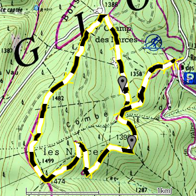
I think my favorite is the distance colorization: it uses alternating black and white bands every 100m (100yd if you’re using imperial units), so you can very easily count the distance between two points on the track. It’s also easier than looking at the scale imagine twisting it along the track.

Distance dashed

Distance dashed

This only works if the track contains a high-enough density of points that MyTrails can alternate colors (which can happen only on a track point, not between points). Generated tracks (from a driving direction service, or by manually adding track points), or highly-simplified tracks (such as you may get from an online track sharing service) may not contain enough track points. Similarly, zooming out causes MyTrails to simplify the track and lose the ability to correctly represent the track.

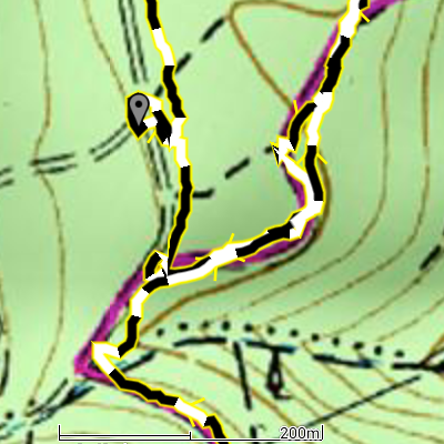
Similarly, if you want to count how long it took to go from one point to another, the time colorization is very helpful. Each band corresponds to one-minute intervals.

Time dashed

Time dashed

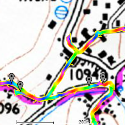
The “rainbow” versions of these colorizations look silly, but they’re useful to try and follow the track through an intersection. Just keep in mind the sequence of colors, and follow along.

Distance rainbow

Distance rainbow

Unfortunately, when you look at these in MyTrails 1.3.24, they will not look as nice and smooth as these screenshots. This is because these were taken with an alpha version of 1.4.0, which I will tease more in another post soon!